Nucleus Design System
Lead Designer in building, maintaining, and managing the design system and process.
Role
Lead Designer
Team
Developers, PM, Localization
Client
Medable
Date
02/2022-Present
Who is Medable?
Medable is transforming healthcare by enabling patient generated data to drive clinical research, healthcare delivery, and personalized and predictive medicine. The trusted, globally compliant HIPAA Medable platform is currently licensed by over 15 U.S. top medical research centers and Fortune 100 biotechnology companies, which collectively serve more than 15 million patients and conduct over 6,000 clinical trials.
Medable’s product is extremely complex. With multiple users, platforms and applications, building their design system from the ground up takes collaborating with designers, teams, developers, PM’s and Directors.
Overview
Problem Definition & Context
A DESIGN SYSTEM THAT REFLECTS THE BRAND
Medable’s Design System was initially a template of components purchased to streamline designer’s work. This pre-purchased component library made designers more confused into which components and styles to use. Without any guidelines or documentation, designers avoided using the design system. For a company with a customer base worldwide, nothing was made or considered with accessibility or localization in mind.
REDEFINING THE FOUNDATIONS TEAM
A few months before I started, the VP of Design created a team called “Foundations.” The idea was to have a collective group of people to discuss all things related to component needs. This included presenting cases for new components, or questions about component use. The problem was that there was no structure or understanding of the overall goal of foundations and how they could help the design team.
ADOPTION WITH DESIGNERS AND DEVELOPERS
There has been a lot of frustration with how the designs visually are presented to developers and how they are implemented. There is a lack of a source of truth, meaning all figma files lack consistency in their designs. There is a lack of communication between dev and design, with no QA to properly explain the intentions and interactions of components. Developers refer to Storybook for their source of truth, but Storybook lacks updates and correct interactive states. Designs are not correctly localized, so a lot of design and layout issues occur when the designs are translated into other languages.
TRANSITION FROM OLD TO NEW FRAMEWORK
Empower and enable experience teams to build/test/deploy web apps rapidly from problem to design to functional artifact (components with backend connections) in a seamless fashion.
Forming a Web Frameworks team will allow us to not only provide fully functional web components that experience pillar teams can use for rapidly building features, but ensure that experience pillar teams are enabled with full documentation, early prototypes and builder tools to make them successful when using these UI components.
Approach & Solution
ALIGN THE TEAM WITH PROCESS
Have a structured and guided understanding to design our products.
IMPROVE CONSISTENCY AND TRUST
Create a source of truth of design and trust that it will improve design and development.
DOCUMENTATION & GUIDELINES
Designers and developers understand how components are used and how to request help.
ACCESSIBILITY & LOCALIZATION
Creating our components to be accessible and localized (from design and code).
BUILD & MAINTAIN
Reestablish foundations and rebuild components from the ground up.
WEB FRAMEWORK TEAM
Create a modern, globalized and accessible React UI component library.
Customer & Business Impact
Save time (and money) for designers and developers
Teams do not have to worry about creating platform based functionalities themselves, but rather focus on delivering value to their customers
Have a way to implement the new framework that is accessible and globalized
Simplify, reduce friction and improve usability across all apps and platforms
Design the Foundation for a new end-to-end experience so we can build a modern, scalable, and self-service platform
Ensure consistency and high quality standards across our designs
My Role and Responsibilities
Lead Product Designer on a team of a Developers, Localization, Pm and Tech Lead
I run the weekly foundations meetings, manage and create all meetings involved in the research, brainstorming, and implementation of our Design system
I work on managing the workflow of all component requests and all rebuilding components
I focus on the Figma component library and Zeroheight documentation
I lead the accessibility audits and make sure our design system is accessible and localized
Measuring Success
The goal of Nucleus Design System is to see an overall 10x improvement in our product development practice - from the time we discover a problem to the moment we deliver a meaningful, viable solution to a customer. The average time right now for this process is 30 weeks and we believe we can realistically see this process decrease to 3 weeks.
Decrease Design time
By shifting designer’s time to solely thinking about how to solve unique problems and assembling already existing components and flows vs. creating them from scratch each time. Designers can mock up design solutions in a fraction of the time it takes them today using 1-off methods.
1 Week > 1 Day
Decrease Development time
Components and Layouts
Reduced to 0. The average time to develop a simpler component like a button with unit tests, fully typed props, WCAG accessibility compliant, globalized, and storybook documentation was 1 sprint. For more complex components like the table component, this increases anywhere from 2 to 4 sprints. Centralizing this work in Nucleus means an individual product team won't have to take this burden, and can build faster with pre-existing building blocks that meet these requirements.
Because layouts are already pre-assembled using available Nucleus components, developers can start with layout templates that are near-complete instead of having to create them from scratch.
Development Onboarding
Achieve a significant reduction in onboarding time of new front-end product developers on Medable’s applications. But creating 1 standardized practice of implementing flows, layouts and components and 1 central documentation repository, it will be far easier for any developer to spin up a new application or contribute to an existing one.
Accessibility rating of pages
Achieve a minimum of AA rating of every flow shipped to the customer with a majority achieving AAA status.
Localization effort
Standardized way of component localization that results in a 75% efficiency improvement in localization for each release.
Right-to-left and character-based languages accounted for in standardized component development vs. each developer having to personally account for these efforts.
Research
PROJECT #1
Governance Research Project
My main objective starting this role was to talk to all the designers to get the following information:
How do you currently work with the Design System + Foundations team?
What are your current pain points when working with the Design System?
At what point of the designers process do they reach out for help with components?
Are there any points of delight with using the Design System ?
What I was hoping to get out of this research project was to understand of all the pain-points so I can help establish a process of trust and effectiveness.
All of the research projects I was fortunate to work alongside an amazing Product Designer from the team! Without her support we would not have all this amazing work and synthesis!
OVERVIEW OF OUR PROCESS
Step 1 - Designer workflow research
Step 2 - Product Design Workflow Affinity Mapping
Step 3 - Synthesizing Data
Step 4 - High Level Process Flow
🔑 Key Takeaway
To form a better relationship with designers and the design system, we created a process guide, which opened up communication and understanding of how we can help. The goal is to start establishing trust and creating governance.
PROJECT #2Foundation Process Guide
From all the data and discussions on how to create a design system that supports adoption and governance, myself, 2 other designers, and the design ops manager created this process guide. The audience for the guide is currently for the design team. Other guides are being made for other people such as developers, PM’s and stakeholder.
PROJECT #3Information Architecture Research
Card sorting activity - IA research project
With the understanding that figma, storybook, and documentation site are the source of truth, I wanted to create a structure that worked best for our product and designers rather than assume an atomic structure would benefit our designers and product.
Myself and another designer worked on this project together. We interviewed over 20 people - all the designers, UX researchers, and a few developers.
OVERVIEW OF OUR PROCESS
Step 1 - Interviewing designers, UX research, and developers
Step 2 - Synthesizing research into affinity mapping
Step 3 - Organizing the date into jobs to be done
Step 4 - Creating new versions of the IA
Step 5 - Testing our new architecture
The new Information Architecture of Nucleus in the Figma component library.
🔑 Key Takeaway
By taking the time to listen to designers, synthesize data, and test again, we established an architecture that best reflects our product and how we work, with consistency in the component library, storybook, and documentation.
Figma Component Library
Audit + Redesign
The design system that existed before Nucleus was a purchased component library with an overload of choices and no guidelines.
No components were build correctly with variants and nothing was made with accessibility and localization.
130 color styles!
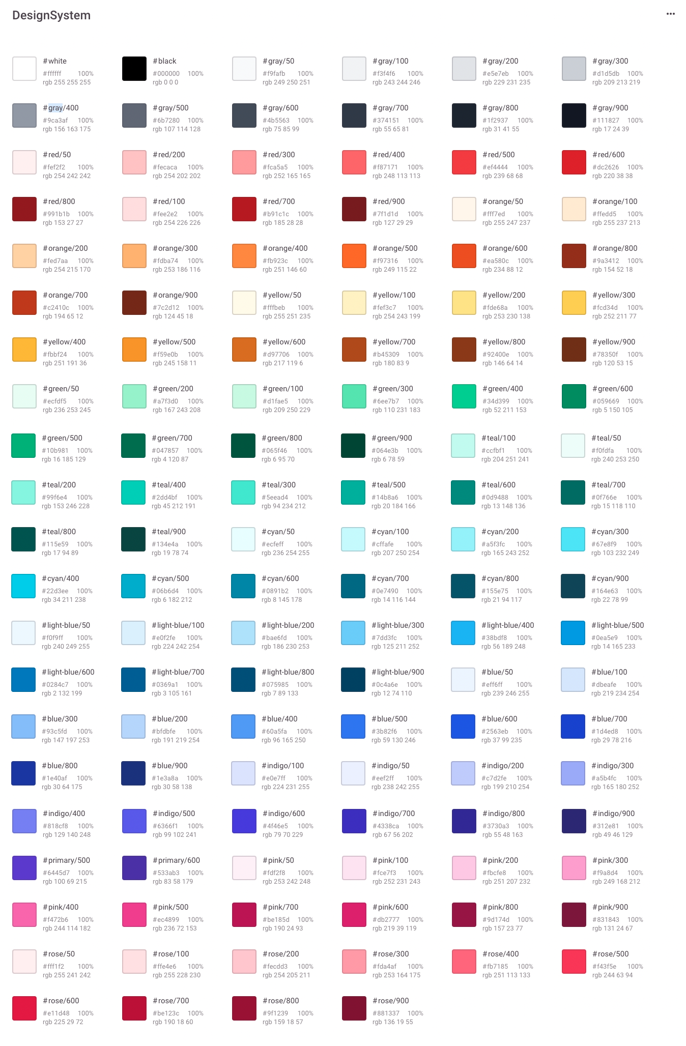
95 text styles!
Way too many unorganized buttons!
New Foundations + Components
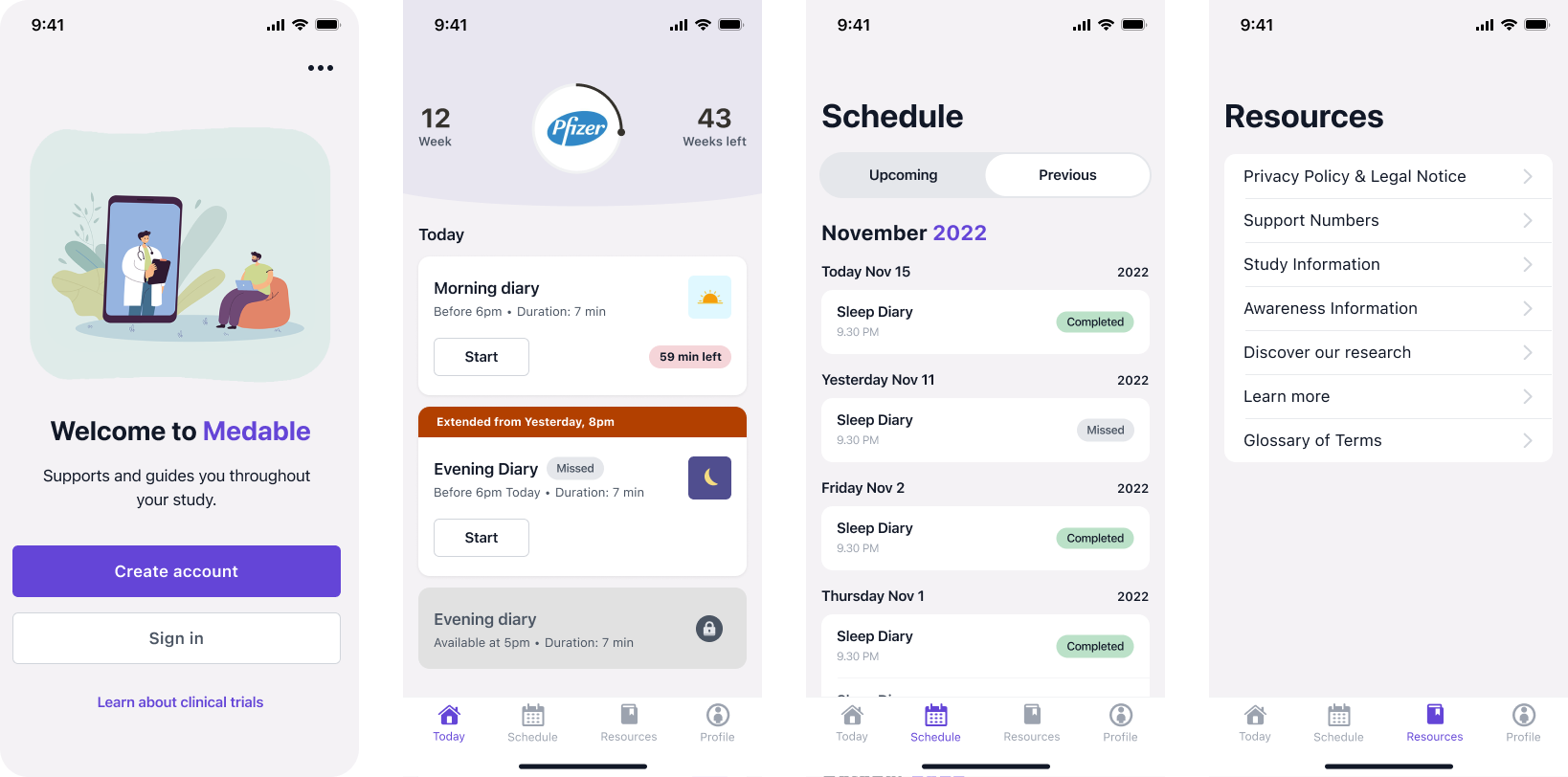
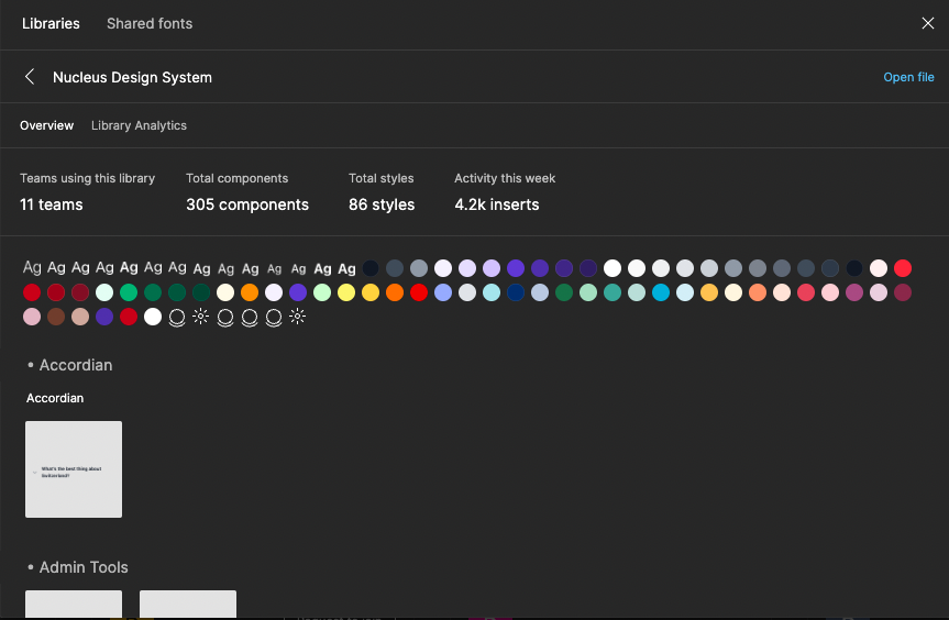
I am happy to share what Nucleus’s component library has evolved into - please feel free to ask and I can screen share some examples of my work.
Accessibility + Localization
Medable did an accessibility audit through a third company. While building the new components fully accessible through code and design, I wanted to make sure we started to take measure to account for any other accessibility issues at hand.
I took the 60 page audit and condensed it into an excel sheet that clearly explains the WCAG criteria and how we can fix the issues we dont fully support.
I had a meeting with the managers about the findings and next steps. The issues are currently being fixed by the platform team and we are talking about next steps to audit the rest of the applications.
BECOMING LEVEL AA COMPLIANT
WCAG Guidelines
WCAG Criteria
Conformance Level - Andoird, iOS, Desktop
Supports
Partially supports
Does not support
Not applicable
What is the issue?
Foundations recommendation in how to support this criteria
How to fix the issue
SPREADSHEET CATEGORIES
💡Now that we established Nucleus, how do we get the company to convert to the new design system ?
Web Framework Team
Patient Web Framework Team
DEV & DESIGN COLLABORATION
CHALLENGE
The biggest challenge after creating a new component library, recreating storybook, and starting zero height documentation is getting the company to adopt the new system.
Our product currently runs on an older framework. The old framework has no component library and is not built with accessibility or localization in mind. Overall it is not sustainable. Developers, the design system team, and some managers came together to form the Web Framework team.
GOAL
The goal is to create a new framework with the Nucleus components and find a way to education and transition the platforms over into the new framework.
Not as easy as it sounds … so we need to continue to show the benefit of the new framework and help spec out all components so they meet all our needs. I am currently working closely with developers and the UX Engineer to make sure all components are built properly, accessible, and localized.
Specs and Guidelines
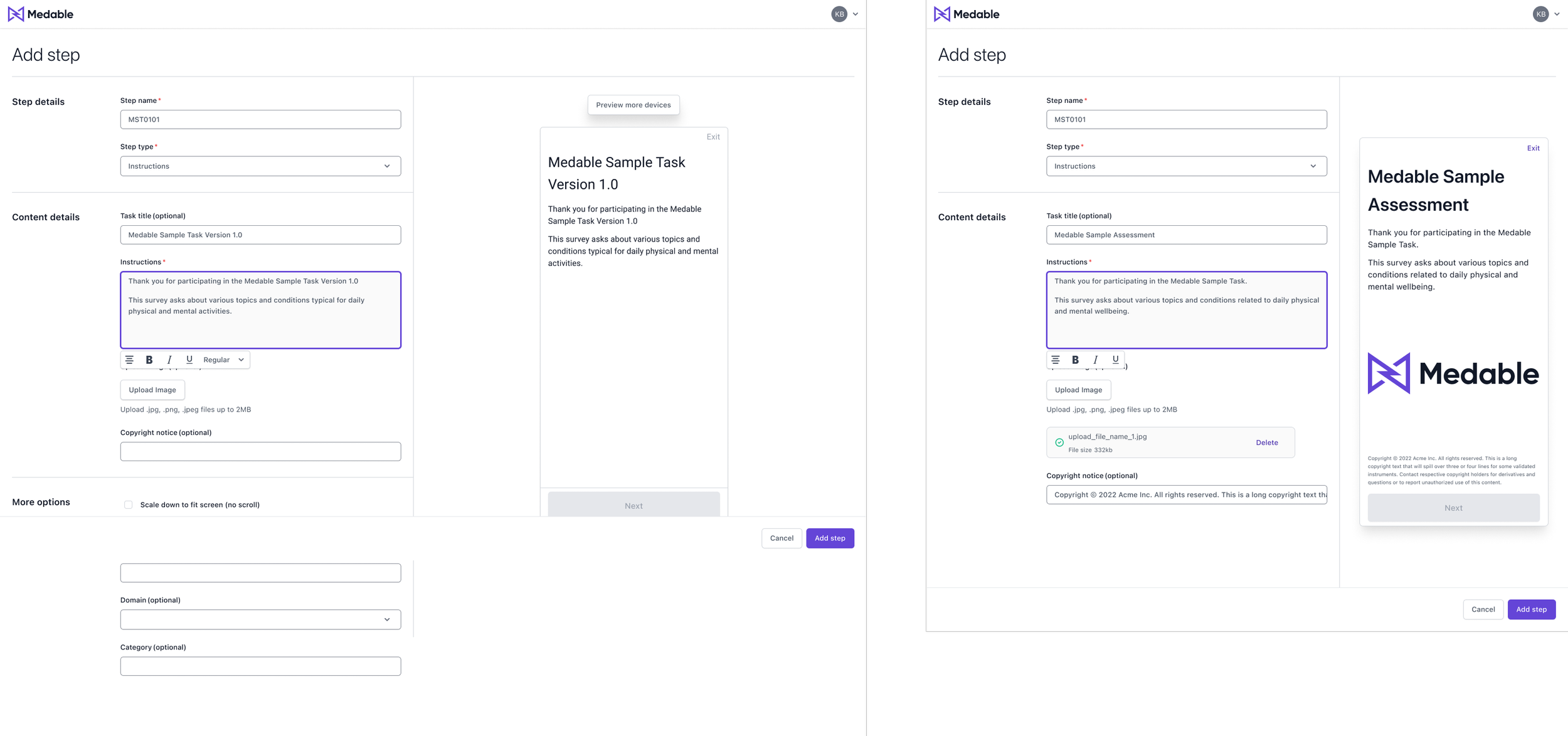
I am happy to share what Nucleus’s Storybook has evolved into - please feel free to ask and I can screen share some examples.
Documentation
Documentation will be a focus in 2023 after the web framework work is prioritized. Below is an example of some documentation work in progress.
I am happy to share what Nucleus’s documentation has evolved into - please feel free to ask and I can screen share some examples of my work.
Accomplishments in 2 Quarters 🎉
COMPLETE
P1: Figma Library (Designers)
P1: React Component Library (for Design + Developers)
Process guide for requesting and building new components
Tracking status of each component in development
NEXT STEPS
Design patterns
Guidelines & Documentation
Move component tracking in Confluence
VISUALIZE FIGMA & STORYBOOK - DESIGNER + UX ENGINEER COLAB!
This video shows how a designer can put together a template in figma and customize it - afterwards it shows how it is being built in storybook.
Metrics
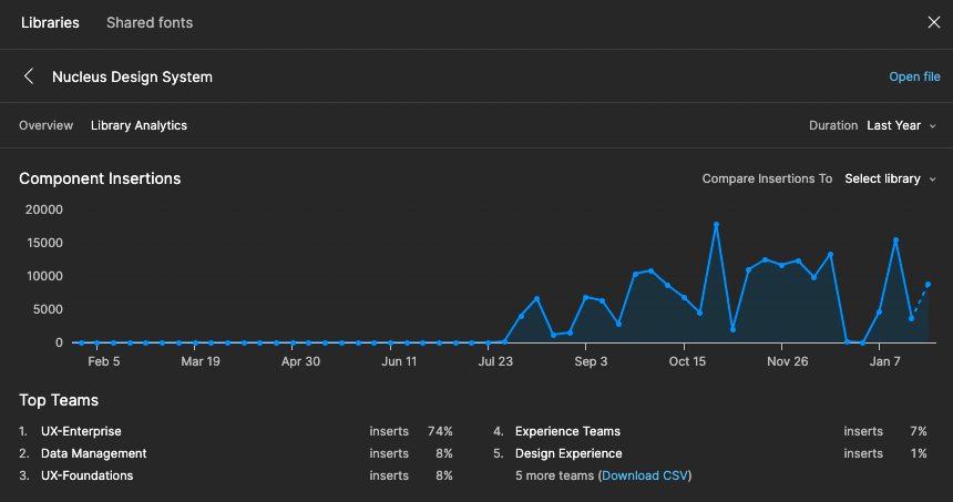
While I am working on adoption for all the other products and mobile, the metrics right now reflect Nucleus usage within 6 months of launching it.
Currently working on …
Scaling our design system to better fit our growing product for different customers
Adding mobile styles and components
Working with stakeholders for adoption
Heavily focusing on documentation of Zeroheight
Reflections (so far)
ACCOMPLISHMENTS
I would have never been able to accomplish this without working hand in hand with developers and finding people to contribute part time time to work with me.
The amount of work we put in to go from a purchased design system to a design system built from the ground up being fully accessible and localized within 3 quarters is an amazing accomplishment!
Currently working on 📲 🖥
DESIGN SYSTEM WORK IN 2023
Expanding Nucleus (system that reflects the enterprise product) to grow into a system that has 3 subsystems to encompass all our products and mobile (native iOS, android and web)
Focus on native application and design system
The main contributor for zeroheight, our documentation and guidelines for specific needs of designers, developers and stakeholders
Currently growing our documentation to align with OKRs
Creating more “General Information” documentation to help designers use Nucleus more effectively
Form a plan with managers and designers to start to transition old to new framework and take into account new components we need while making the transition
Tracking component lifecycle
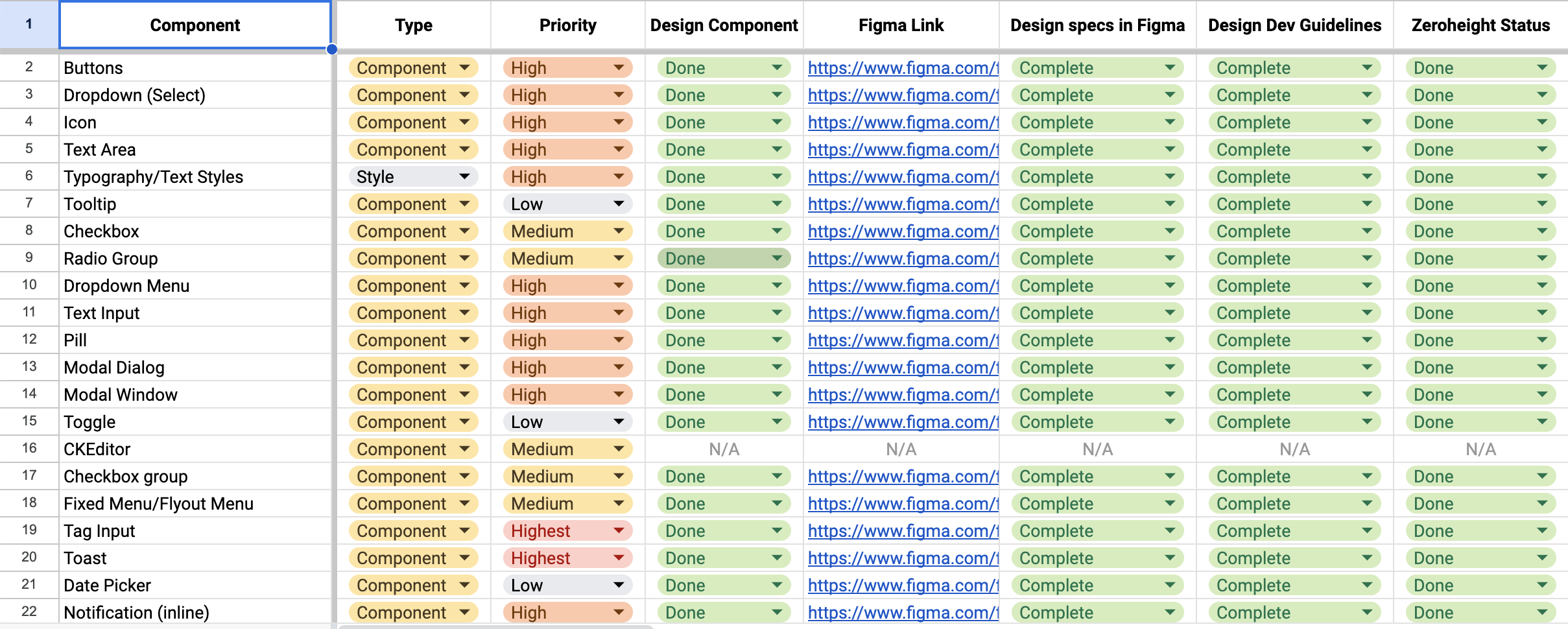
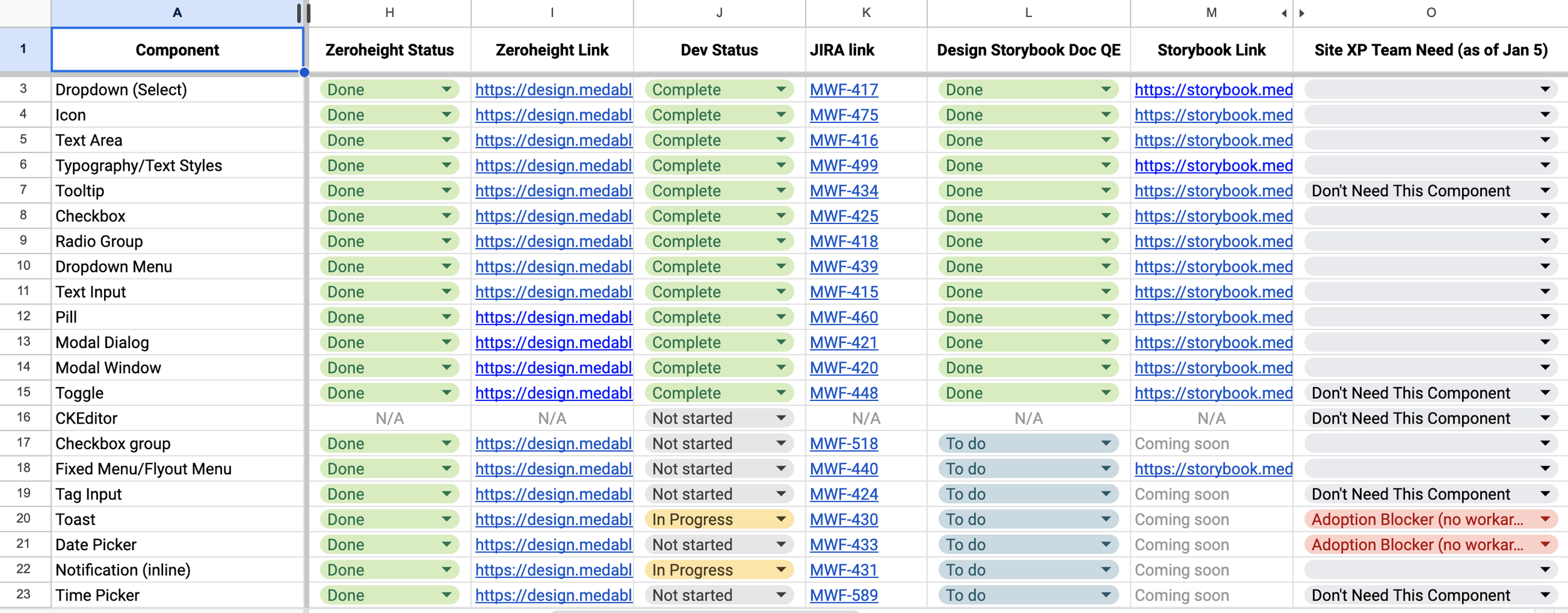
Nucleus Component List
A way to track progress of components and current needs and blockers for teams
Focusing on mobile web and native